Accessible Headings and Font Styles
Properly applied heading styles will assist users who navigate the page with and without the use of assistive technologies, supporting diverse groups of users with both visual and semantic landmarks for easy navigation.
When heading styles are assigned to text in the visual editor, users can choose how font will be displayed from the Format drop down menu.
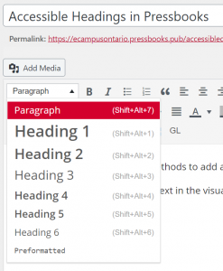
These editing options do the following:
- Change the text’s visual appearance.
- Change the text’s semantic structure, or the associated HTML code and reading order of the page.
Best Practice for Using Headings in MacSites
- Add a logical structure to your page by starting with Heading 2. As the page title uses Heading Style 1, this allows users to navigate the page’s content quickly.
- Heading styles should be used in numerical order (for example: 1, 2, and 3 instead of 1, 3, and 2).
- Headings should not use All Caps. All Caps can be difficult to interpret for visual learners and be read as acronyms by some assistive technologies.
ORIGINAL
MacSites provides users two methods to add and edit content: the visual editor and the text (html) editor.
When heading styles are assigned to text in the visual editor, users can choose how font will be displayed for users from the drop down menu.

If users access the Text editor, text with an applied heading style will have the corresponding heading style tag before and after the text. For example, Heading Style 2 will have <h2> and </h2> wrapped around your text. These tags can be added manually if you are comfortable with HTML code.
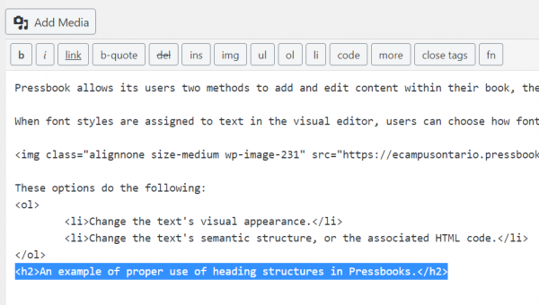
These editing options do the following:
- Change the text’s visual appearance.
- Change the text’s semantic structure, or the associated HTML code and reading order of the page.
Best Practice for Using Headings in MacSites
- Add a logical structure to your page by starting with Heading 2. As the chapter title uses Heading Style 1, this allows users to navigate to the page or chapter’s content quickly.
- Heading styles should be used in numerical order (for example: 1, 2, and 3 instead of 1, 3, and 2).
- Headings should have appropriate colour contrast (visit following sections on colour contrast).
- Headings should use larger text than the body text.
- Headings should not use All Caps. All Caps can be difficult to interpret for visual learners and be read as acronyms by some assistive technologies.
*Note: some changes to header formatting must be made within the Custom Style Sheet (CSS) of your associated theme. Accessible versions of each default MacSites theme will be available at the end of this section for download.
Best-Practice for Accessible Font Styles in Digital Contexts
- Sans serif fonts (Calibri, Arial, and Open Sans).
- Font size of 12-14 or larger.
- Bolded text.
- 1.5 minimum line spacing.
Font Styles to Avoid in Digital Contexts
- Serif fonts: Times New Roman.
- Italic or underlined fonts: Freestyle Script.
- Compressed fonts: Bernard MD Condensed.
- Fonts with uneven line weights: Broadway.
- Decorative fonts: Algerian.
- ALL CAPS.
- Underlined text that is not a hyperlink.
- Complex symbols or characters without alternative text.
Accessible Lists
Creating accessible lists within MacSites is very simple and can greatly benefit the reading and comprehension for users who do and don’t use assistive technologies to access web environments and content.
Best Practice for Using Lists in MacSites
- Lists should be created using the Bulleted list (shift+alt+U) or the Numbered list (Shift+Alt+O) options within the Visual editor.

Creating lists using these methods will visually structure your list (for example, indenting and increasing the paragraph spacing before and after text) and will allow assistive technology users to identify when a list has been included on your page.
Accessible Hyperlinks
Creating accessible hyperlinks will improve the experience for all users who interact with your content , but are particularly necessary for those using certain assistive technologies (e.g. screen readers).
creating hyperlinks in MacSites
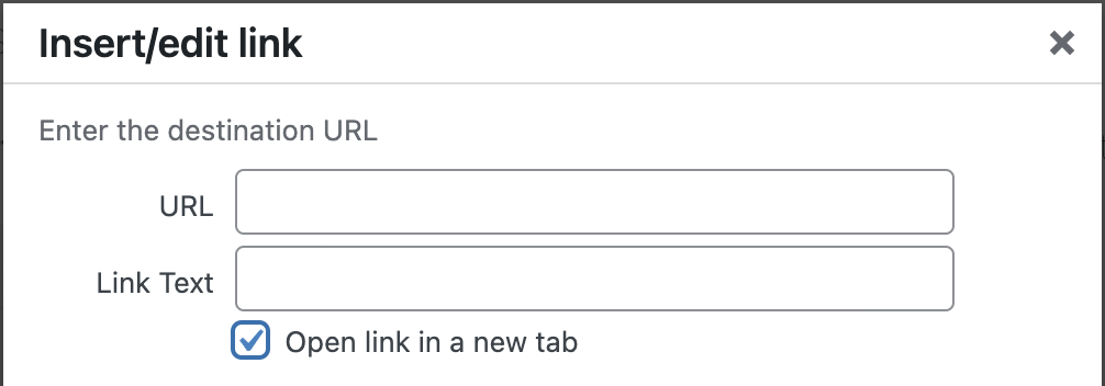
- Highlight the text you would like to hyperlink, select the Insert/Edit link button in the Visual editor, and paste the URL into the field that appears.

Best Practice for Accessible LINKS in MacSites
- Linked text should be descriptive, or the user should be able to perceive the purpose of the link based on the text that has been hyperlinked.
- Linked text should be unique. Creators should avoid using different URLs for the same linked text. This is commonly seen with “Learn More” or “Click Here” links on pages.
- If a link directs users to an external site, you can set the link to open in a new tab by clicking the link option “gear icon”.
![]()
Alternative Text
Alternative text is one of the most important accessibility considerations for creating inclusive visuals within MacSites, as these descriptions (hidden to visual users) provide essential visual context, descriptions, and clues to non-sighted users navigating web environments and content using assistive technologies (e.g. screen readers).
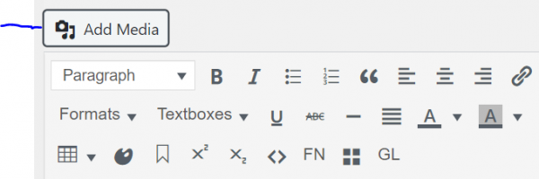
- Upload your media to MacSites using the Add Media button
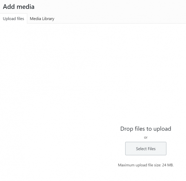
- Browse your computer to upload an image or drag and drop files into the browser.
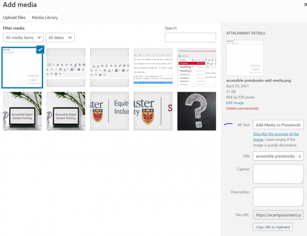
- Add your alternative text to the Alt Text field or leave blank if the image is decorative.
Best Practice for Using Alternative Text in MacSites
Decorative and Simple Image Descriptions
- If an image is only used for visual decoration, mark it as decorative by leaving the Alt Text field blank.
- If an image can be described in one (1) to two (2) sentences, include a description in the Alt Text field.
- These descriptions should avoid the use of repetitive descriptors such as “a photo of” and “an image of.”
- Alternative text should describe, or interpret, what is important about the image.
- **If interpretation of a visual element is a learning objective of a course or assessment, a detailed description of the image should be provided.
Complex Image Descriptions
- If the image cannot be described in one (1) to two (2) sentences, include a longer description.
- Alternative text descriptions for these images should have: A concise description of the image, pointing users toward a longer description that is created and available below the image or linked to an Image Description section at the end of the chapter.
- Longer descriptions can take the form of figure descriptions or be links to external webpages that describe the image in full.
- If an image contains a large amount of text, this text should be duplicated in the longer description.
- Alternative text descriptions for these images should have: A concise description of the image, pointing users toward a longer description that is created and available below the image or linked to an Image Description section at the end of the chapter.
- Proper alternative text is critical for ensuring the information provided in an image is not lost in a digital environment (for example, the image upload link breaks or is no longer available).
- If images or icons are used to link to another page, they should describe the purpose of the link, not the visual appearance of the image or icon (unless this is meaningful).
- If a logo has been included on the page and is related to the content (for example, author attributions), include the logo’s name in the alternative text.
For additional information on creating Accessible Image Descriptions, please visit BCcampus Open Education Accessibility Toolkit, 2nd Edition, Images
Colour Contrast
Colour contrast is the contrast value of two adjacent colours. Sufficient colour contrast is very important to improve accessibility, and can be difficult to evaluate without using a tool.
This often refers to the colour contrast of the text against the background on a page, but can also be applied to visual elements such as graphics, charts, and graphs.
Web Content Accessibility Guidelines (WCAG) 2.0 AA Colour Contrast Requirements
- Text must (AA) have a contrast of at least 4.5:1 for body text and 3:1 for headings.
- Text should (AAA) have a contrast of at least 7:1 for body text and 4.5:1 for headings.
- Adjacent colours within graphics should (2.1 AA) have a contrast of at least 3:1.
- Colour must (AA) not be used to convey meaning. For example, if colour is used in a legend, additional information such as labels or symbols should also be used.
How to Check the Colour Contrast of your Page
- Obtain the hex colour codes (for example, white is #FFFFFF) of the colours you would like to check.
- If you are using McMaster brand colours, these colour values are available on page eight (8) and nine (9) of the Digital Brand Standards Manual.
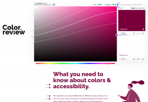
- Use a free colour contrast checker, such as color.review, to obtain the contrast for your colours.
- If your background colour is white, the hex code should be #FFFFFF. If your background colour is black, the hex code should be #000000.
- If you would like to share the results of your colour contrast check, copy the link at the top right of the page.
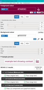
- There are also several free applications, such as Colour Contrast Analyser, for checking colour contrast that do not require a hex code to check contrast.
- To obtain a colour’s hex code with this application, use the dropper tool (second from the right) in order to “pick up” the colours you would like to compare.
- If you are using more than one monitor, this application may have difficulties checking the colours of elements that are not on the same monitor as the checking tool.
McMaster Brand Colour Comparisons
- If you are using McMaster brand colours together, it is very important to check the contrast of those two colours if their contrast is not provided below.
- It is recommend to aim slightly above AAA or AA contrast to account for differences in monitors or poor internet connections.
- Achieving AAA contrast will also prevent the need for further remediation at a later date when legislative guidelines change.
- The “Highlights” colours should not be used on white unless they are being used for decorative purposes only.
WCAG 1.4.6 Contrast (Enhanced) AAA – on White
- Heritage Maroon (7A003C): 11 (Pass AAA Headers, AAA Text)
- Heritage Gold (FDBF57): 1.6 (Fail)
- Heritage Grey (5E6A71): 5.5 (Pass AAA Headers, AA Text)
- Brighter World Red (A6192E): 7.5 (Pass AAA Headers, AAA Text)
- Brighter World Green (007B4B): 5.1 (Pass AAA Headers, AA Text)
- Brighter World Blue (007096): 6 (Pass AAA Headers, AA Text)
WCAG 1.4.6 Contrast (Enhanced) AAA – on Black
- Heritage Maroon (7A003C): 2.7 (Fail)
- Heritage Gold (FDBF57): 12.7 (Pass AAA Headers, AAA Text)
- Heritage Grey (5E6A71): 3.7 (Fail)
- Brighter World Red (A6192E): 2.7 (Fail)
- Brighter World Green (007B4B): 3.9 (Pass AA Headers, Fail Text)
- Brighter World Blue (007096): 3.7 (Pass AA Headers, Fail Text)
Tables
Although tables can be very helpful tools for presenting large quantities of data, they are often used in situations where it severely impacts the experience for users of assistive technology.
Best Practice for Using Tables in MacSites
- Tables should not be used to control the layout of a page.
- Tables should have a header row and/or header column.
- Within MacSites, this must be added within the Text editor. Please see below for a step-by-step explanation.
- Cells should not be merged as this can impact the reading order of the table.
- Complex tables should be split into simpler tables when possible, especially to avoid the use of merged cells.
- Empty cells should contain “No Data.”
- The Caption checkbox should be selected and a meaningful title should be included for the table.
- Header background colours can be changed by adding to the html code. Please see below for a step-by-step explanation.
Inserting Tables with the Visual Editor
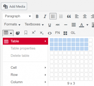
- Insert a Table by using the Table button in the Visual editor.
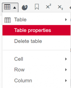
- Access the Table properties button in the Visual editor.
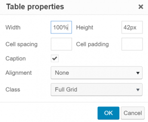
- Select the Caption checkbox and change the Class to Full Grid if you would like cell lines to be visible.
Improving Accessibility of Tables with the Text Editor
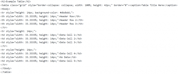
- The image above is the html code for the Example Table at the end of this page. Modifications were necessary to optimize the accessibility of this table.
- The header row’s tags were changed from <td> (row) to <th> (header).
- An accessible background colour was added to the style tag of header row (background-color: #dbdbdd;) to add visual emphasis.
- #dbdbdd is McMaster’s Neutral Tint colour.
Example Table
| Header Row | Header Row 2 | Header Row 3 |
|---|---|---|
| Data Cell 1 | Data Cell 2 | Data Cell 3 |
| Data Cell 4 | No Data | Data Cell 5 |
Video and Audio
Video and Audio elements can be valuable additions to your MacSites publication. It is critical that alternative formats be included so that all users can interact with this content.
Using the Accessibility +1 Formula1, videos should be captioned and audio content should have a transcript.
Due to the storage limitations within MacSites, it is not recommended to store audio and video files using Add Media.
Audio in MacSites
- If audio has been stored in an online repository, such as Soundcloud, it can be embedded by pasting the URL into the Visual text editor.
- If audio has been uploaded to a platform that does not allow oEmbed, it must be externally linked.
- If audio does not have an accompanying visual that displays text, a transcript is the only way some individuals will be able to interact with the content.
- Transcripts can be stored externally and linked on the page as a Word or a Plain Text document.
Video in MacSites
- If a video has been uploaded to a website that supports oEmbed, such as Youtube, pasting the video URL into the Visual editor will automatically embed the video into your page.
- For other platforms, MacSites may allow users to embed the video using <iframe> code in the Text editor.
- If you would like your resource to be viewed publicly, MacVideo public-access videos can be embedded.
- If you would like to limit access to McMaster community members, Microsoft Stream videos can be embedded.
- All pre-recorded media must have, at minimum, automatic captions available.
- For Microsoft Stream, MacVideo, and Echo360, these can be automatically generated when uploading your video to the platform.
- For most MacSites themes, embedded videos will display best when 600 – 700 pixels wide.
References
- Morgan, Michelle. (2020). Accessibility in Higher Education: Considerations & Strategies During Coid-19 / EDUCAUSE Online Course
Self-Assessment
Please fill out the MacSites Accessibility Self-assessment below. This quiz can be completed multiple times.
